The main purpose of creating a business website is to increase sales.
You aren’t just trying to impress your relatives with a business website. Or…are you?
You have a website because you want to grow your small business. You want to sell more of your products or services.
So, to do that, you will need a method that will convert the leads you get on your website. In other words, you need a perfect landing page on your small business website. A page that will help you get sales.
You worked your socks off to bring visitors to your website. You utilized many techniques to attract customers to your small business. Now WHAT?
It is all worthless if you don’t have a proper landing page on your website. You are losing potential customers. Because, without a good landing page, the visitors will get all confused and leave.
So, let’s leave the small talks behind and get right into the topic on how to create a perfect landing page for your small business because that’s what you came here for.
First and foremost, you need a website.
I recommend using WordPress for creating a website because…why not?
WordPress is free. It takes less than 5 minutes to get started. It pretty easy to use and customize. You can also use converting landing page designs for free.
So, get hosting from SiteGround (they will give you the domain name for free) and follow these instructions. Your website will be ready in no time.
After you have your WordPress website ready, you need to install a landing page theme.
In WordPress, a theme is the design and layout of your website.
You can easily change the design of your website by changing the theme. You won’t lose your content while changing a theme. And, changing a theme takes a few easy clicks.
Isn’t that cool?
There are many free and paid WordPress themes available. But, mind you, not every one of them is good for creating a perfect landing page.
A perfect landing page must have some elements or features. So, you need to select the WordPress theme that has them.
6 Elements Necessary for a Perfect Landing Page
1. Clean Design
This is the most important thing for any website.
Your website should be clean.
It shouldn’t be clogged with unnecessary content. Only put the things that are required on your landing page because you want your visitors to stay on your website and take action.
You should write clear concise information.
When someone visits your website they should feel like “Wow, this is what I needed”, not “where is the thing I need?”.
So, use a WordPress theme that is designed to improve User Experience (UX) and has a great User Interface (UI). UX and UI play an important role in determining the effectiveness of the website.
There should be a smooth flow of information on your landing page. The fonts should be legible and color scheme should be friendly (to the eyes also).
Another thing you should note is that your website shouldn’t have heavy “modern” effects. Latest CSS effects may look cool but it will not only make your website slow but also distract your users from the main cause i.e. click on the button you want them to click.
2. Clear Call to Action (CTA) Button
What do you want your visitors to do on your website? Buy your product, Signup, Contact you, Watch a Video, or Download your product?
Decide what you want them to do and place a CTA button.
A CTA button should look distinct from the rest of your website. It should catch the eye of the visitors immediately.
You can experiment with the color and the text of the CTA button.
But, you should never request the visitors to take two different actions on the same landing page. If you have two requests, put emphasis on the primary action– make the second button visually softer.
If you have a scrollable landing page, you should put your primary CTA button in two places. One above the fold, and one at the end of the content so that users don’t have to scroll back to the top of the page just to click on the button.
In a nutshell, the CTA button should be easy to understand, accessible, and compelling enough to take action.
3. A Contact Form
This is necessary if you want to collect the visitor’s data or if you run a consulting firm.
A contact form on your landing page will also make the user feel at ease because they can ask questions if they want more information.
There’s also another benefit of a contact form.
You can improve your business with it. You can analyze the messages you receive and understand your customers.
You can understand which services or products your customers like. What type of customers your service attracts. And then, you can improvise your business using that information
Knowing your audience is always important
4. Place to Tell Something About your Business
Let your customers know your business’s mission. Tell them something about why you started the business.
This helps you build trust with your customers.
You can write an interesting story about how your business started and who is behind the business. This will help you create a bond with your visitors.
If you donate some percentage of the sale’s profit to a charity, you need to mention it on the website.
You can also provide your contact address and phone number.
So, your website (WordPress theme) should have a section where you can talk about your company.
5. A Section to Show your Services/Products you Offer
Well, what’s the use of a website if you can’t showcase your products or services?
So, a landing page should have a region where you can display and talk in short about your services/products.
But, you shouldn’t place all the products on the landing page.
Showcase only the products you want to sell or the product that has the most potential. You can know which product is in demand with the help of the contact form or sales data.
6. A Spot for the Testimonials
People like reviews.
They feel a little more comfortable if other people have already tried out your service. If other people have already bought it and liked it, new customers will most likely buy it
So, always keep testimonials on your landing page.
Ask your clients for their genuine testimonials and display them on your landing page.
Okay, great!
You now know what is needed on a landing page.
That means you now have to go through thousands of WordPress themes, sort them out, and find a theme that fits all the requirements.
Not Necessarily.
Because.
Here are two WordPress themes that match all the elements required to create a landing page and are absolutely free! They are beautiful as well.
Don’t trust me? Check them out for yourself.
Free WordPress Themes for a Perfect Landing Page
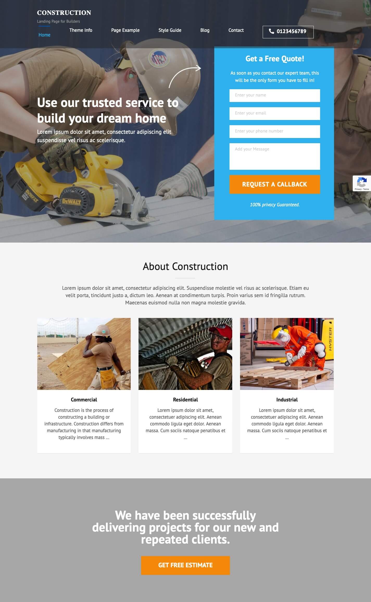
Construction Landing Page

Construction Landing Page is a free WordPress theme for a construction company or any small businesses that want to create a converting website. Although the name of the theme is construction, you can use it to create a perfect landing page website for any kind of business.
The theme has an above-the-fold contact form and a CTA button that catches visitors’ attention.
It is a simple, clean yet elegant and professional landing page WordPress theme that was designed with conversion in mind.
The theme is responsive, SEO ready, and speed-optimized. You can also use the theme in your local language.
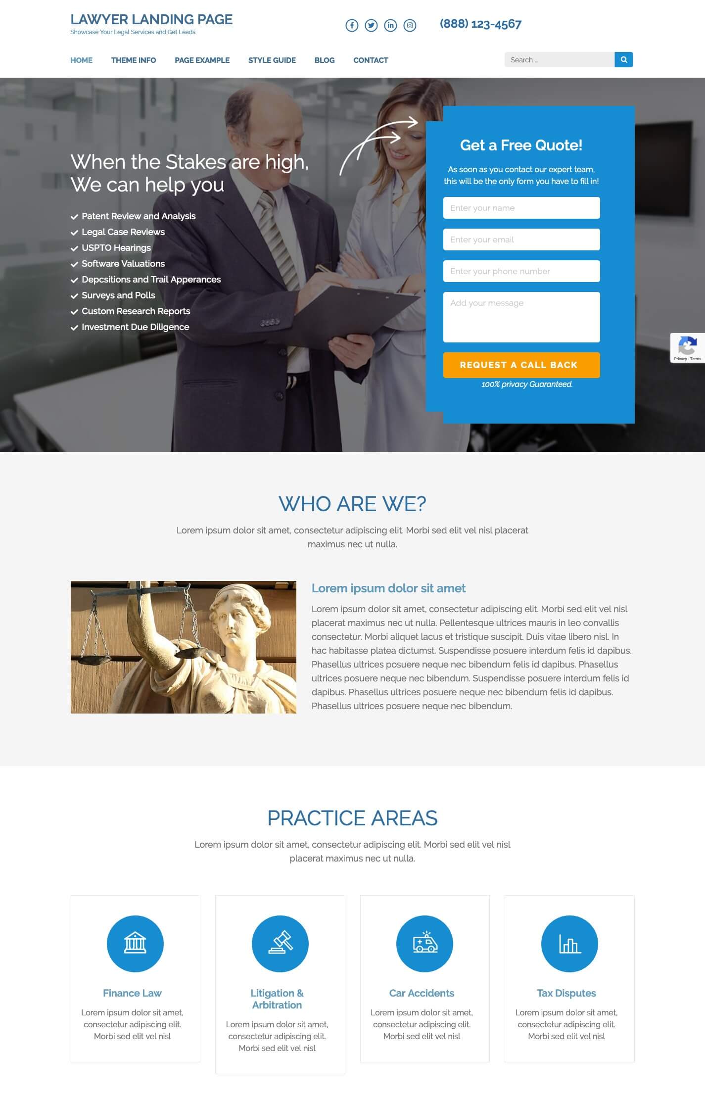
Lawyer Landing Page

Lawyer Landing Page is a free Lawyer WordPress theme suitable for any type of business. Again, don’t go after the name. You can use the theme to create a landing page for any kind of business website.
What makes Lawyer Landing Page the perfect landing page theme? Its call to action optimized design.
You can also display everything about your company, from what it does to where it is located, right on the landing page.
Like Construction Landing Page, the Lawyer Landing page also has an over-the-fold contact form.
The theme is clean and looks professional.
Also, because it is not loaded with heavy CSS effects, your website will perform better.
SEO friendliness and responsiveness comes out of the box.
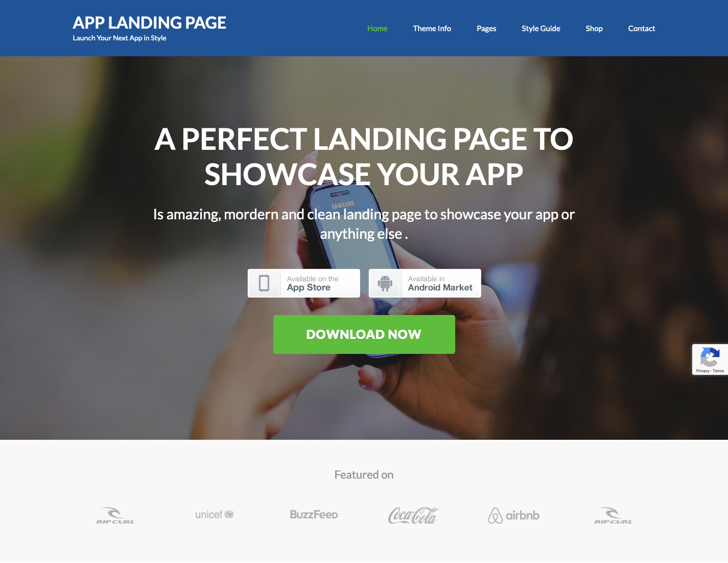
App Landing Page

App Landing Page is a free landing page WordPress theme suitable for businesses that want to impress their visitors with a clean and beautiful user interface. If you want to launch a product with an impact, you should use this theme.
The theme has an over-the-fold Call to Action button for maximum conversion. Although the theme was designed for launching apps, you can utilize the UI for any kind of business website. The theme also has a video section and a newsletter section for increasing user engagement.
The theme comes with 4 custom widgets and can be customized easily.
The theme is fully responsive so you can target a wide range of customers. App Landing Page is also SEO ready and Speed Optimized.
Conclusion
A perfect landing page should urge visitors to take action. You can add backstories (about company, services, and testimonials) to motivate the users to take the desired action.
The CTA button on a landing page website should be attractive and visible. You should experiment with the color and the action text to determine what works best for you.
Also, you shouldn’t stroll your visitors on your landing page. So, you should always be clear and precise. Don’t make them go to other pages of your website, that may distract them from the main cause.
If you follow these guidelines and use a good landing page design for your website, your business will grow in no time.
